 20 Terms
Home > Terms > English, UK (UE) > Gap logo
Gap logo
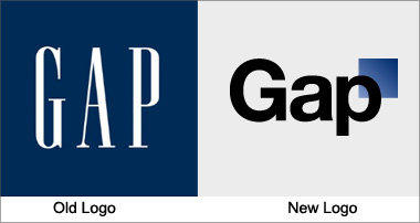
Gap has used the same logo for over 20 years, instantly recognisable with its stretched, white letters against a navy blue background. Yet the company recently released a new logo, created in collaboration with the customer community, to widespread indignation. It has been called a “Microsoft Word” creation and a “prototypical brand panic move”. Gap is already rethinking the change.
This is auto-generated content. You can help to improve it.
0
0
Improve it
- Part of Speech: noun
- Synonym(s):
- Blossary:
- Industry/Domain: Apparel
- Category: Coats & jackets
- Company: Gap
- Product:
- Acronym-Abbreviation:
Other Languages:
Member comments
Terms in the News
Featured Terms

Industry/Domain: Financial services Category: Personal investment management
Ultra Magnus
A group of authority each person to pay, and then returns a pen for them to agree on an interval, usually one-year initial lump sum financial ...
Contributor
Featured blossaries
Carissa
0
Terms
6
Blossaries
1
Followers
Rhetoric of the American Revolution
Category: Education 1 20 Terms
20 Terms
Browers Terms By Category
- Muscular(158)
- Brain(145)
- Human body(144)
- Developmental anatomy(72)
- Nervous system(57)
- Arteries(53)
Anatomy(873) Terms
- General boating(783)
- Sailboat(137)
- Yacht(26)
Boat(946) Terms
- Home theatre system(386)
- Television(289)
- Amplifier(190)
- Digital camera(164)
- Digital photo frame(27)
- Radio(7)
Consumer electronics(1079) Terms
- Biochemistry(4818)
- Molecular biology(4701)
- Microbiology(1476)
- Ecology(1425)
- Toxicology(1415)
- Cell biology(1236)
Biology(22133) Terms
- Economics(2399)
- International economics(1257)
- International trade(355)
- Forex(77)
- Ecommerce(21)
- Economic standardization(2)